 I promised not to give an immediate reaction to the new jersey.com website, when it finally went live last Monday. This was in order to give the developers a chance to get all the new content loaded and sort out any major bugs etc.
It’s now been live for over a week and the time has come to pass judgement. In every respect the new site is a major disappointment. It is uninspiring, the indexation is confusing and illogical and in some respects the content seems completely amateurish. Here are just a few issues:
- Imagery -where are all the fabulous images of Jersey that will inspire visitors to book? The size of the images on the site is far too small and completely uninspiring. Compare this with the VisitWales site – which uses spectacular imagery throughout the site and just makes you want to be there.
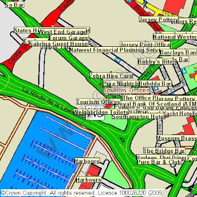
- Maps – goodness knows who has supplied these. They are dreadful! Cramped and confused, missing huge amounts of data and poorly laid out (see image above). Yuk! Yahoo Maps provide a clear mapping service of Jersey - why not partner with them?
- Restaurants – just a rehash of the old site’s directory. And the first restaurant on the list? No, not a lovely local restaurant serving Genuine Jersey produce, but ‘A Taste of India’!
- Getting to Jersey – I want to fly on a scheduled flight from London Gatwick and enter the details into the search box. What do I get? Not just a list of the airlines, but a list of tour operators as well, which is totally confusing. Look at the flight search box in this Blog & provided by Skyscanner - it's a far more effective marketing tool and cost nothing!
I could go on. The worst part of this whole business is that the website cost £250,000 of valuable Tourism Development Funds. I simply cannot believe that this poorly designed site has cost that much, with rehashed content from the old site and a design that does nothing to inspire & attract potential visitors. How must the local agencies, which were overlooked for the project, be feeling now? They would have done a much better job, for a quarter of the price.
Jersey.com is our industry's most important marketing tool and according to Tourism Director, David de Carteret at the recent industry conference - 'is at the heart of everything we do'. In my view the new website is a major disappointment in both design and construction and someone should take the rap for wasting so much public money.
Has anyone got anything good to say about it? If so, let’s hear from you….


1 comment:
It is now back to the old blue site!
Post a Comment